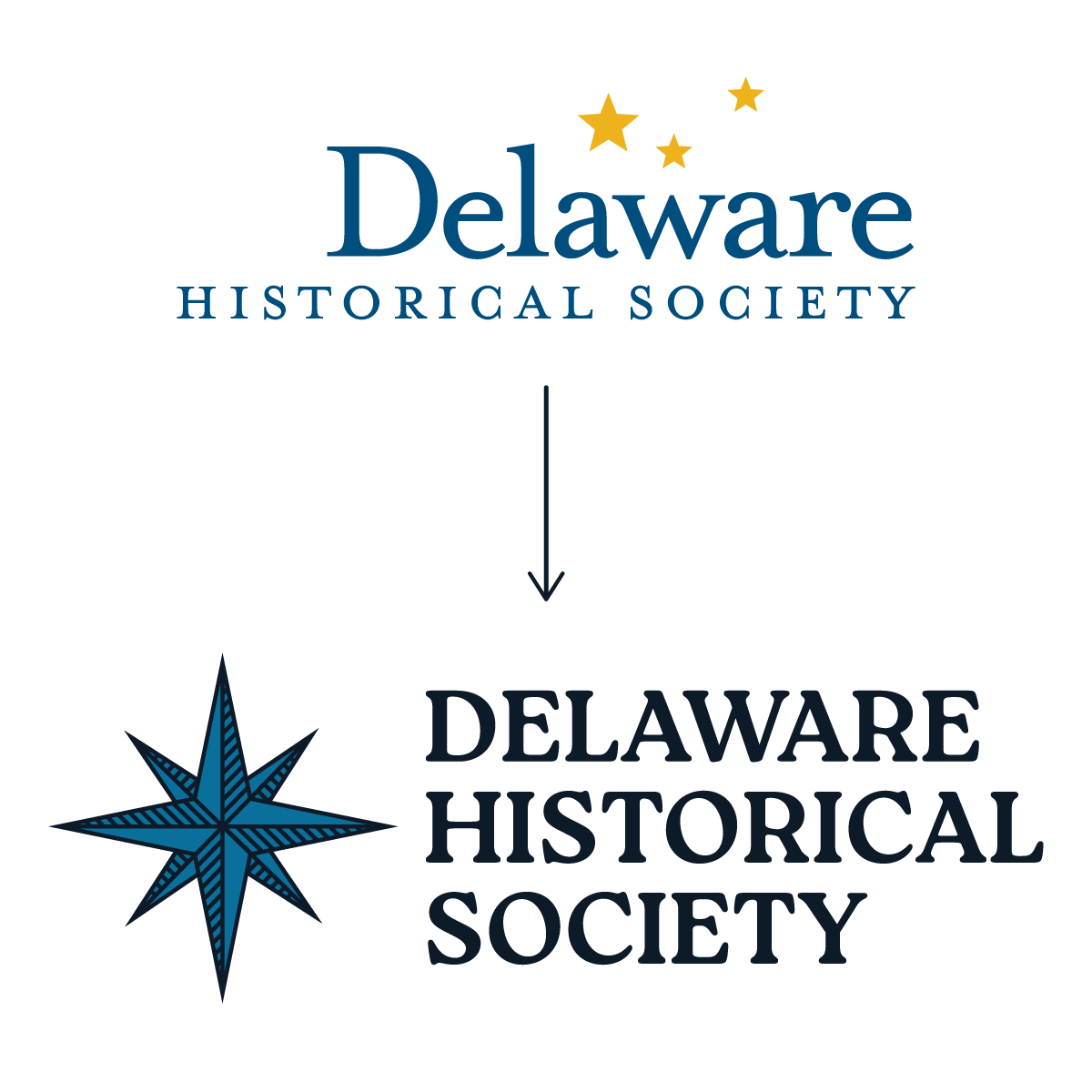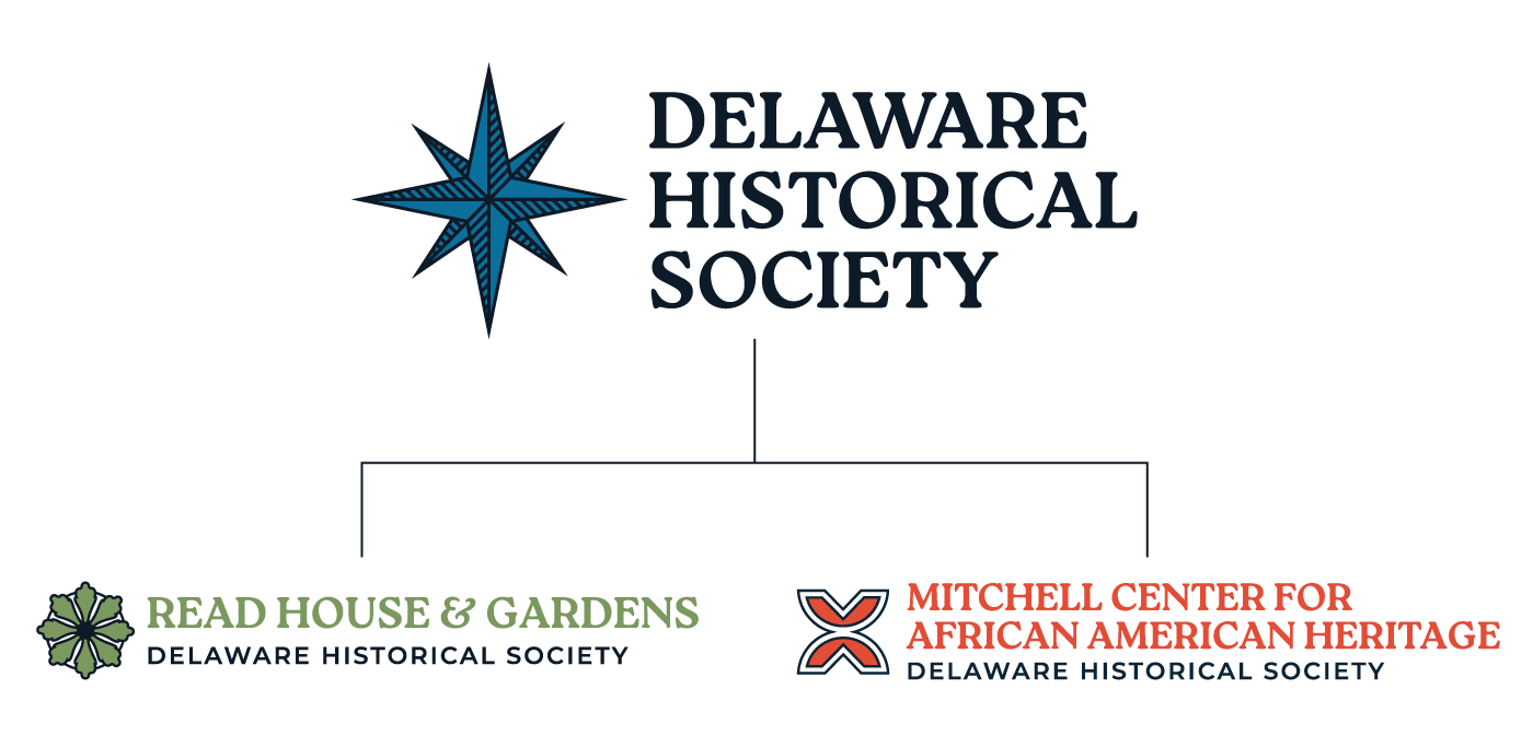
DHS Brand IdentityThe Delaware Historical Society's brand had evolved into a collection of disconnected identities, making it difficult for audiences to recognize the relationship between the Society and its historic properties. To strengthen recognition and create a more cohesive brand story, I developed an endorsed brand architecture that unified these entities under the Delaware Historical Society while allowing each to maintain its own distinct identity.
At the center of the rebrand is an eight-pointed star inspired by a compass rose, symbolizing exploration, discovery, and Delaware’s maritime history while serving as a beacon that connects communities to shared heritage. Building upon elements of previous branding, the single star replaces the former three-star motif, representing a unified organization that serves the entire state while supporting its family of brands.
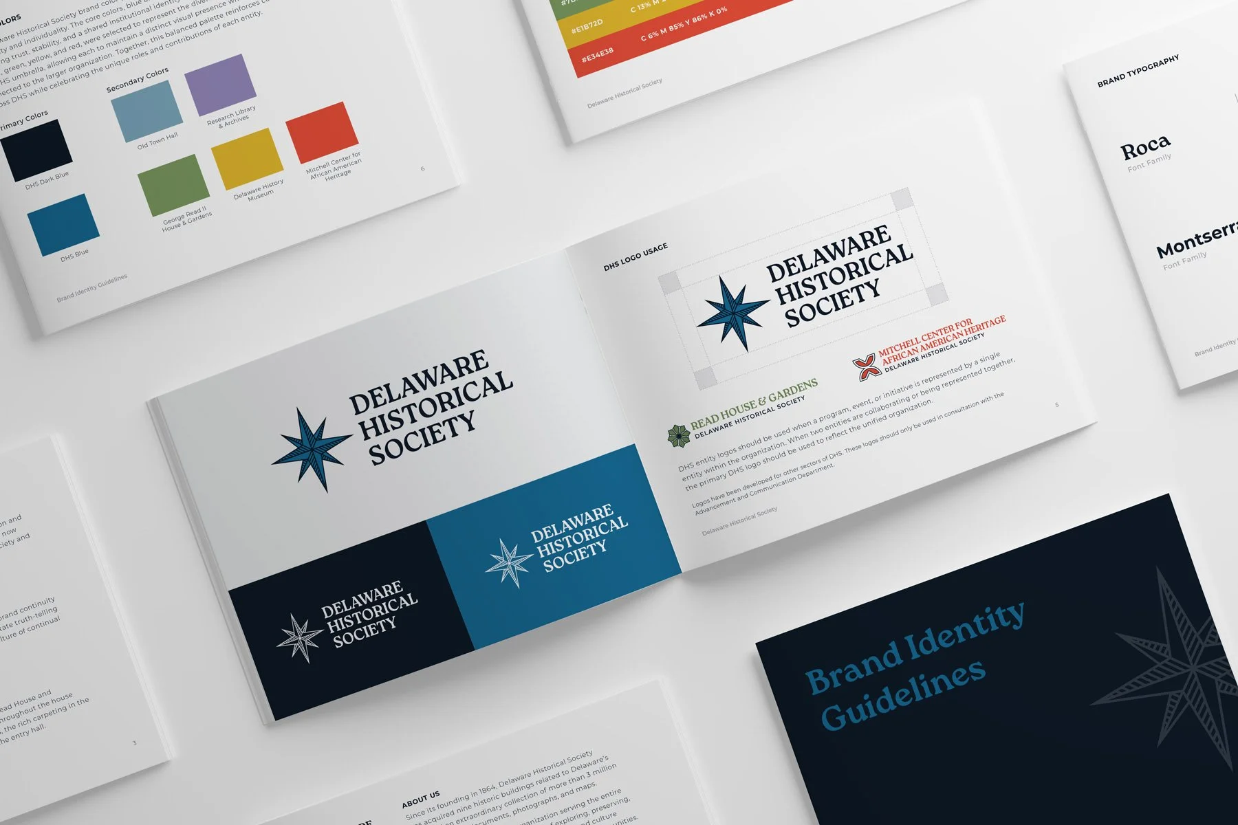
The DHS icon system draws from meaningful visual elements that connect each entity to its history and mission while maintaining a cohesive overall brand. Together, these icons are unified through the DHS color palette. Core blues establish a sense of trust and continuity, while accent colors—purple, green, yellow, and red—distinguish each entity, allowing individuality within a consistent and recognizable system.